Skip to content

bundler

In my yearn for simplicity as a developer, I’m always looking for ways to reduce code. I found a personally fascinating tiny purpose use for esbuild via Jake Lazaroff.

At the time, I was reviewing the upcoming contrast-color() function that Webkit added, which is pretty compelling. One of the blogs I read mentioned that Jake had another solution that he came up with for color selection based on contrast. Very cool! So I perused around this neat subdomain called TIL and found another entry that immediately had my brain on alert.

Run a development server with live reload

After reading that it was possible to use esbuild for building, bundling, and live reload with no extra dependencies, I opened up VSCodium. I used a blank folder to initialize NPM and install esbuild for one reason.

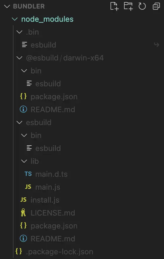
How many folders and subfolders show up in the /node_modules/ folder?

screenshot of node_modules for esbuild showing minimal folders and files

I was once again shocked. Somehow, this is all that’s installed from running npm install esbuild and somehow this is all it takes to have build, bundle, and live reload capabilities!

I then set up the suggest project structure to test it out:

src/
|-- index.html
|-- index.ts
|-- style.css
|-- livereload.js

I kept the code in each file minimal, almost identical to what Jake suggested, but I was running into one problem. While the localhost page was showing what was contained in index.html, it wasn’t actually performing any live reloading. I couldn’t understand what I did wrong.

Additionally, I assumed that running the webuild command that Jake suggested would literally generate a new /build/ folder in the root folder of the project I created. Nope, nothing. Somehow something was working, but not live reload.

Frustrated, and without answers, I let it sit for a few days.

This evening, Jake followed up from a social media inquiry asking if I had luck.

@asuh did you end up getting this working? i just set up a new repo and i had no issues with it.

i don’t see the build folder actually being created on the filesystem, i think in serve mode it just keeps everything in memory.

Hmm… hold on, it keeps everything in memory. This means… maybe I won’t see a literal build folder generate into the project? Maybe?

Okay, so I reviewed my code to see what I had, fired up the server again using npm run dev, still the same issue. Why? Then I saw the script source attribute, which contained the build folder its path. I removed it.

That did it!

I had a working live reload, a bundler that transpiled typescript to javascript, and it builds all the files on demand. What a miracle!

This might not be useful in large projects where everyone’s using countless NPM packages. I’ll have to think more about this with anything I’m using because I’ve also actively started using Vite as my go-to build system for new projects. But, maybe, just maybe, this esbuild idea could turn into something even simpler!

I mean, I know we’re quickly approaching a reality where I can actually use HTML, CSS, and JS for the majority of what I need without too many abstractions. I’d need templating, so either server side JS or PHP, which I’ve used for decades, would give me the rest. It’s a fascinating time for the web.

I created a Github repository for this bundler so that I have reference in the future and as a proof of concept.

https://github.com/asuh/bundler

thinking…

If you’re seeing this, you’re subscribed to the RSS feed or you’ve figured out how to see into my archives.

Today, I added a mostly blank index.html file on asuh.com so that this post isn’t directly accessible on the homepage.

UPDATE 04/2025: I took the file down, still thinking…

I need to think about the value of this site as a personal vessel of data. Part of me is ready to wipe a lot of my digital presence from existence since everything here is basically used to train all the immoral AI and populate LLMs from these companies who didn’t ask for my permission.

I don’t know what I’ll do next. I’m slowly deleting old accounts and data from other online places since it’s unnecessary for them to exist.

I’m not finding joy in writing publicly, either. It’s personal and public documentation, maybe others benefit from time to time, but ultimately it’s my personal value that mainly benefits me.

Let’s see how I feel in the coming days and weeks.

defensive fetch response

In 2023, while deep in the trenches of my engineering manager role, I decided to purchase a license to access react.gg, “The interactive way to master modern React”. I followed ui.dev team’s work for the last few years, and they often released material that’s been quite helpful to learn React and modern Javascript. This course is just another perspective for brushing up on what I know and pushing myself to learn more.

In the course, I came across a comment reply made showing a good way to use fetch(). The following was initially asked:

I am flummoxed by the assertion that this code is not wise:

function getGithubProfile(username) {
  return fetch(
    `https://api.github.com/users/${username}`
  ).then((res) => res.json());
}

What is the correct way to obtain data from an external source? In other languages, I’ve been using functions for decades to retrieve data from external sources.

His response included a defensive approach to fetching data:

async function getGithubProfile(username) {
  let response;
  try {
    response = await fetch(`https://api.github.com/users/${username}`);
  } catch (error) {
    throw new Error(`Network error: ${error.message}`);
  }
  
  if (!response.ok) {
    const message = `HTTP error! status: ${response.status}`;
    throw new Error(message);
  }
  
  let data;
  try {
    data = await response.json();
  } catch (error) {
    throw new Error(`API response error: ${error.message}`);
  }
  
  if (!data || typeof data !== 'object') {
    throw new Error('Invalid response format from the API');
  }
  
  return data;
}

While I’ve used and seen plenty of snippets from this function in various places, this was the first time I saw it constructed like this. Using fetch like this is one of a few ways that this function could be written, but it’s also very readable and easy to understand.

Here are the four things this structure is doing:

  1. Using asynchronous code to fetch data and return a Promise using async/await
  2. Using try...catch statement to allow the fetch and catch responses or error
  3. Throw errors for Network issues, response status issues, API issues, or response formatting issues
  4. Safely returns the data fetched from the URL or API

Now, let me attempt to destructure this defensive code block.

try…catch

First, we need to fetch some data, so we’ll access an external URL, this example from Github.

async function getGithubProfile(username) {
  let response;
  try {
    response = await fetch(`https://api.github.com/users/${username}`);
  } catch (error) {
    throw new Error(`Network error: ${error.message}`);
  }

  /* more code below */
}

First, we declare a variable called response that’ll be referenced and reassigned throughout the function. This might seem kind of redundant considering it’s called almost immediately inside of the try block. Interestingly enough, we have to declare response outside of the try block because of block scoping, which applies to using const and let. If we declared var response inside of try {}, because of hoisting, it would actually work in the function. Theo (t3.gg) made a video going more in depth about the constraints of the try block.

The first call of response is in the above referenced try...catch syntax construct containing the code to fetch the data or return a network error. Using both async to convert the function to be asynchronous Promise as well as the await expression to suspend execution until the returned promise is fulfilled or rejected is one of the best modern features of Javascript. If the response does not work properly, an error will display to let the user know there’s an issue.

validate the data

Before we even work continue to work with a response containing data, let’s make sure the fetch request was okay by returning a HTTP status code of 200, representing a successful response.

async function getGithubProfile(username) {
  /* fetch the data */

  if (!response.ok) {
    const message = `HTTP error! status: ${response.status}`;
    throw new Error(message);
  }

  /* more code below */
}

If the response was anything but okay, this conditional will throw an error with the status code.

json the data

Time to convert the response to a readable format for Javascript

async function getGithubProfile(username) {
  /* fetch the data */

  /* response validation */

  let data;
  try {
    data = await response.json();
  } catch (error) {
    throw new Error(`API response error: ${error.message}`);
  }

  /* more code below */
}

After setting a new variable for the data, we resolve the response to a JavaScript object. This object could be anything that can be represented by JSON β€” an object, an array, a string, a number, etc. Now the fetched data is ready to be used by javascript.

On the other hand, if there’s an error with the returned data for any reason, such as malformed JSON, it’ll once again throw a new error.

Note: It’s also here that you might need a different resolve type. For example, there are cases where you’re working with a string response that isn’t or doesn’t need to be JSON formatted data. In that case, your response could be returned using await response.text() to return a string. There are several other method types that can be applied here as well.

type validation

What happens if we get through everything but the data itself doesn’t actually resolve to a valid object or the data is just plain corrupt? This is an often forgotten step in fetching data where we should do one last check to make sure we’re actually returning a valid data type, object in our case, or just making sure the data is still available. If not, throw an API error.

async function getGithubProfile(username) {
  /* fetch the data */

  /* response validation */

  /* resolve data type */

  if (!data || typeof data !== 'object') {
    throw new Error('Invalid response format from the API');
  }

  /* more code below */
}

return the data

At this point, the data has survived multiple check stops to make sure the result of the data is exactly what we need. So, all we have to do is return the data.

return data;

Voila! Now we have a fully functioning and very safe function to fetch data for our site or application.

For React, this type of function can either stand alone outside of a component to be invoked in the Component, or it can also exist directly in React.useEffect() to grab the data when the component mounts or updates based on a state change.

fetch promise

By default, fetch() is really a promise, allowing you to cover a lot of these checks that are located inside of the multiple try...catch blocks. Here’s an alternative syntax, often referred to as then/catch for fetching:

fetch('https://api.github.com/users/${username}')
  .then((response) => {
    if (response.ok) {
      return response.json();
    } else {
      throw 'Error getting users list'
    }
  }).then((data) => {
    /* handle data */          
  }).catch((error) => {
    /* handle errors */
  });

Both methods are Promise chains, both handle responses and errors in similar ways. There’s nothing wrong with using the above, it’s perfectly valid! Why use try...catch over then/catch built-in promise syntax?

The primary difference is the addition of the async/await in ES2017. Ultimately, using this syntax offers a cleaner to read, easier to understand method to retrieve the data. There’s no nesting of then/catch methods, which can be common in then/catch blocks.

Here’s a great Smashing Magazine article going over examples between try...catch over then/catch.

Happy fetching!

Updates

  • August 14, 2024 – Added additional context around the try block and a video link to YouTube
all in on popover modals

Let’s talk about the new popover feature added to HTML. I decided to create a few versions of a modal that contains a search form, just to both get experience as well as prove that this is a good new use of a popover. I am biased but I’m completely on board!

Because responsive websites have so many features that need to work from small to large devices, sometimes we have to make decisions that universally provide necessary features but don’t add too much complexity for users. One of those is a search field that can fit on all devices, and it’s this feature that led me in the direction of a modal.

Yeah, I know, modals are overused. They distract from the main content, take focus away from the important parts of site. However, adding a search form to a modal provides a much used feature with minimal impact on mobile layout structure, allowing for more components in a small area.

Screenshot of mobile header for stopthethyroidmadness.com
This is an example of a search component on a mobile sized device with a minimal footprint

To activate the search form, the magnifying glass icon is a button and requires to be pressed or tapped. A search form appears inside of a modal that overlays the screen, blurring the background.

Screenshot of mobile search modal that's open on stopthethyroidmadness.com
The search form appears in a modal on top of the content

Since spring of 2024, we have a new feature of HTML, using an attribute, called popover. This new addition to the language provides some really great superpowers:

  • No javascript required!
  • Automatic overlay, highest z-index
  • Light dismiss (clicking/tapping outside of the popover element)
  • Default focus management
  • Keyboard binding for improved accessibility support
  • Support for ::backfill pseudo element (wanna blur the background without extra code!)

If I was talking to my 2000s web designer self, he would describe this as magic! Because, well, it really is so simple and easy.

Here’s a CodePen of my first version of this:

The best thing about the above component is that you can try it out on all the modern browsers with success… unless you’re using Safari on iOS. With the help of Luke Warlow, he found and reported a Webkit bug that the light dismiss behavior doesn’t work.

Because of the above bug, in order to have universal support, I created another version that includes a button inside of the popover that mostly duplicates the button trigger that opens the popover, but instead this one closes and dismisses the popover.

Just to fun, I took one more try at making a version that uses the dialog element, which has been available since 2022. The main reason I did not go this route was to attempt a new, accessible element with no javascript. Buttons that open dialogs have at least one inline onclick="dialog.showModal()" attribute that’s required for the dialog to appear. Adding light dismiss also requires a little script, as you can see in the CodePen example. Additionally, the dialogs don’t need any additional code for focus to just work right, which is very nice.

You have your choice in these examples so feel free to borrow or steal whatever you want!

come on, safari

I’m nearing the end of the first phase of a website redesign, teaching myself new CSS, and sprinkling in some JS. Of the things I’m learning, I’m also rediscovering some old Safari linear-gradient issues and seeing some new Safari positioning bugs.

You can follow along if you view the CodePen titled “color-scheme, light-dark, Safari bug”.

The original point of the above pen is to verify linear gradient issues with Safari.

Webkit-based linear-gradient issues are well documented, they behave differently because of the transparent color values. You can see this by switching the theme mode from light to dark, or dark to light. I keep running into linear gradient issues in Safari because I infrequently use them with transparent values and forget they’re still an issue.

CodePen screenshot after switching pen from light mode to dark mode, showing linear gradients that are not ideal
CodePen screenshot after switching the theme mode from light to dark, showing linear gradients that are not ideal. It also shows that the aspect ratio isn’t a square as it should be.

Try the above pen in Firefox or any Chromium browser and the linear gradients are consistently working when switching between dark and light mode.

I found 3 more issues having created this:

  1. In .square, Webkit doesn’t seem to center things consistently using just place-items: center. I am forced to add place-content: center to make the content “this is a square” center consistently with the other modern browsers
  2. aspect-radio: 1 / 1 doesn’t actually work right for the content area of .square. It’s elongated into a rectangle.
  3. Adding position: fixed to .square, which is already centered using the place-* rules breaks the positioning only on Webkit. I am forced to use older positioning methods, i.e. left, top, and transform.

sad twentytwentyfive

Quoted GitHub – WordPress/twentytwentyfive by WordPress (GitHub)

Twenty Twenty-Five is built as a block theme. The theme aims to ship with as little CSS as possible: our goal is for all theme styles to be configured through theme.json and editable through Global Styles.

This makes me sad.

In a different system, a configuration file like theme.json would be considered a design token where a design system will automatically generate a JSON file full of tokens to be used in a component library or website. The potential for design tokens are quite high, but sadly they’re less practical without tools that are configured to both generate the design token file or system and give easy access for developers to use them. Right now, it’s still piecemeal and there’s not a great workflow in many systems.

Modern WordPress development is abstracting a subset of CSS to a JSON file, for the ease of builders and publishers. The developers who build Block Themes are kind of being forced against the grain of the web in the development phase. Developers consumed by a Javascript-centric system, this might make a lot more sense. But, for those of us who want to build using the technology that browsers provide, this is very unappealing and backwards.

This is just another reason I can’t see how much longer WordPress will be serious going forward. Maybe the update to React 19 in Gutenberg will change things, considering that it makes Web Components a first class integration, also considering the possibility of using React Server Components. But, I haven’t seen anything that gives me an indication either of these are being really thought out.

This quote was from the TwentyTwentyFive Github Repo.

svg background images to inherit light-dark value

With the spirit of using new widely supported, Baseline CSS rules, I’m implementing light-dark() as a simplified method to allow light and dark mode on a website. This function is a game changer, very simple to apply color modes for websites, so I’m a big fan already. That said, using SVG images as background images exposes an edge case that took me down a rabbit hole leading me to CSS masks.

Let’s apply light-dark using color-scheme for the site.

:root {
  /* NOTE: Use @supports for <= Safari 17.4 (2024-05) */
  @supports (color: light-dark(black, white)) {
    color-scheme: light dark;
	  --surface-color: light-dark( #ccc, #333 );
	  --text-color: light-dark( #333, #ccc );
  }
}

I’m applying carets to navigation menu item links, which look like this:

navigation item link named "Resources" with down-pointing caret on the right of the link

So that chevron or caret on the right side of Resources, which is pointing down, is applied to the anchor element as a background image.

a {
  background-image: url("data:image/svg+xml,<svg xmlns='http://www.w3.org/2000/svg' width='24' height='24' fill='currentColor' [...]");
}

Why am I adding an SVG as a background image here? Wouldn’t it be easier to add SVG to the source code? Well, yes, but this is WordPress, and since I’m pulling in the navigation menu from an API, the markup is auto-generated and formatted so it’s not easy to add in additional markup into the API results. I’m sure we’ve all faced similar limitations on generated code from an API, so I was determined to attack this problem and find a solution.

Additionally, I’m not referencing an additional file as a way to save an HTTP request, one of the many micro-optimizations for better performance. This also gives us the ability to easily cache the image, or if I decide to use an SVG sprite in the future, this saves multiple requests.

Back to the code above, see that fill='currentColor' rule? It doesn’t work as you would expect because, regardless of the SVG being added a background image, the SVG is being treated as an external resource. Considering this, we can’t apply the currentColor value to inherit the anchor’s color.

In the Stackoverflow I just linked to above, there’s a reference to Coloring SVGs in CSS Background Images, which provided me a big clue to solve this, which is using CSS masks. It worked… kinda!

I converted everything from background to be mask, because the syntax is mostly identical, and added a background color for the mask to work correctly. Well, that actually hid the text of the anchor element, so while I was now able to see the background caret with the correct color mode text color, the actual text was hidden. To this point, I’ve purposely been trying to not use ::after pseudo-elements out of principle, just to make things a little simpler. Time to break through the ego and add back that pseudo-element!

The final code that works for me:

a::after {
  background-color: var(--text-color);
  content: "";
  height: 100%;
  mask-image: url("data:image/svg+xml,<svg xmlns='http://www.w3.org/2000/svg' width='24' height='24' fill='currentColor' aria-hidden='true' viewBox='0 0 20 20'><path fill-rule='evenodd' d='M5.23 7.21a.75.75 0 011.06.02L10 11.168l3.71-3.938a.75.75 0 111.08 1.04l-4.25 4.5a.75.75 0 01-1.08 0l-4.25-4.5a.75.75 0 01.02-1.06z' clip-rule='evenodd'/></svg>");
  mask-position: left 17%;
  mask-repeat: no-repeat;
  mask-size: 0.9rem;
  position: absolute;
  width: 100%;
}

Problem solved!

search form + popover api

Wresting with whether or not I should move forward using the Popover API for a search form, almost solely to delete the javascript code for the same type of interaction.

I’m hung up on default focus *not* going to the search field. I discovered that it’s only a tap of the tab key away, which is very helpful, but that default focus would be the clincher for me.

This probably won’t improve accessibility either.

This is so tempting!

The following Codepen link is a demo of what I’m considering. It’s really, really cool to see this work so easily with two new attributes! Mindblowing.

codepen.io/asuh/pen/jOojyJB

updated the site again

Reached a stopping point to update asuh.com using the new Forage theme I put together.

github.com/asuh/forage/

It’s nice to remove so much from my previous iteration and simply things with some modern CSS.

Forage is such a great tool for classic theme developers and I should continue improving it where I can.

Next, I’m going to probably update another site with Forage that uses Gutenberg and see how that goes. I believe it’ll be a hybrid block theme this way.

laravel blade > php?

Filed an Issue

This is mostly reproduced from a Github issue I created for the new Forage WordPress theme I created. I’m thinking out loud whether or not to support a new branch with plain ‘ole PHP instead of the Blade syntax.


Laravel Blade has some notable features that help PHP developers move faster. Here are a few reasons to keep using it:

(quickly generated by ChatGPT, with edits and additions by me)

  • Layout Components: Blade offers the @component directive for defining reusable components, such as navigation menus, alerts, or forms. This promotes encapsulation and reusability for components containing HTML, CSS, and JS.
  • Escaping by Default: Blade automatically escapes output by default, helping to prevent XSS (Cross-Site Scripting) attacks. This enhances the security of your application by reducing the risk of injecting malicious code into your HTML. While PHP provides functions for escaping output, Blade handles this automatically, reducing the likelihood of accidental omissions.
  • Template Inheritance: allows you to define a base layout with placeholders that child views can fill in with their own content. This enables a more structured and modular approach to building views, reducing duplication and promoting code reusability.In other words, PHP would require explicit includes everywhere for PHP files to work with each other. Blade uses hooks like @yield as placeholders to work with various functions like @section.@yield('content") in the base file would render @section('content") in the child view file, such as page.blade.php`.
  • Control Directives: Blade provides convenient directives for common control structures, making it easier to express conditional logic and iterate over data.Example@if () as plain PHP would need PHP tags, looking like <?php if () ?>. Essentially, it’s more verbose to use plain PHP.
  • Concise Syntax: Blade offers a concise and readable syntax for common tasks such as echoing variables ({{ $variable }}), control structures (@if, @else, @endif, etc.), loops (@foreach, @for, @while), and more. This makes Blade templates easier to write, understand, and maintain compared to raw PHP embedded within HTML.
  • Template Comments: using {{-- This is a Blade comment --}}, which is not rendered in the final output.
  • Include Statements: In addition to @include, which mostly mirrors plain PHP, Blade also provides the @includeWhen and @includeFirst directives for conditional inclusion of templates.

I attempted to order the above in the order of importance, with the top few being quite more efficient than plain PHP.

My overall observation is that Blade should truly be considered if you can think of good use cases for adding components rendered by PHP. At some point, it might be less useful as Web Components find their way into the WordPress ecosystem.

Additionally, the auto-escape and inheritance for Blade is pretty great for efficiency. The benefits of these features are quite convenient.

The rest are just nice little sprinkles to clean up PHP. Nice, but not necessary.

If I review everything I’ve used with Blade, I really don’t think I have any real needs yet for PHP driven components. All the rest of the bullet points could easily have been regular PHP in my own personal work flow, but I’m really only using themes on smaller sites that don’t have a lot of complexity.

If Blade is removed from any project, you likely have the option to completely remove a dependency on Composer as well as some application methods to render the Blade syntax into PHP. I can also see this argument for those who prefer to stay as close to the original languages as possible.

At some point in the near future, decisions to support Laravel Blade might come down to whether or not you want a build step to compile a language. There’s a potential future approaching where the browser contains so much power that build steps can once again become optional. That’s a very interesting future!