minimalism on a modern tech stack
It’s time I redesigned my website with modern technology
I used to love redesigning my website. The amount of care and attention was sparked largely in part by a growing online community promoting web standards, beautiful web designs and the distance I created by moving away from most people I knew. As technology changed, I experimented in small bursts here and there.
Since converting my site over from MoveableType to WordPress in 2005, I spent countless hours and nights learning how to create custom WordPress themes. It was an endless task of trying to style every conceivable element I didn’t even know I had to. I was a developer with designer envy, using every tool I could think of in these bursts to push the boundaries. Most of my custom themes lacked polish because of this perpetual digital journey for education.
Within the last year, I finally decided it was time to refresh my site, this time with a finish that sparkles. My goals for this new design:
- Custom theme based on Roots Sage
- Minimalism
- CSS from nothing
- No jQuery
- Loading times under 5 seconds
I’ve needed something to force me to learn CSS Grid Display since most of my projects depend on Bootstrap. Front-end design is a commodity, sponsored by Bootstrap, and I want to prove to myself something else was possible.
This is my case for the elegance of using as little possible CSS and JS as possible within WordPress.
Custom theme based on Sage
 For more than 7 years, I’ve hosted two custom themes on Github that I duplicated from WordPress and other sources. I modified theme to include various features, CSS and the latest changes to H5BP. Around that time, I also saw the Roots theme getting popular. It included many of the same principles I used in custom themes, but Roots had a growing community of people helping. I started experimenting with it more regularly in 2014 but it never landed in any projects I worked on. So, my site was my opportunity to finally deploy it.
Sage is developed best with the Roots stack: Trellis, Bedrock and Sage. The stack uses multiple technologies with which I’m familiar now:
- Vagrant VM
- Composer
- Node.js + Yarn
- Browsersync
- Autoprefixer
- PHP 7+
- Sass
- Git
I really enjoy the portability of firing up a VM on the fly for development work. MAMP and others like it are solid but are too mixed in with the OS. Vagrant, and to a larger extent Docker, provide an unique isolation from the OS that feels more efficient.
Getting Sage up on a localhost with this stack takes only a few minutes and comes with the perk of live reloading via Browsersync for quick development. Sage currently includes Webpack for asset bundling and building and I’m still learning how that works. Gulp.js and Grunt were the previous builders and I’ve used them in several other projects as efficient builders.
Minimalism
I studied multiple sites from those in the web community as inspiration and to learn what trends are popular. With a clean slate and no boundaries, I chose to create a minimal theme style. In the mid to late 2000s, I designed various forms of minimalism for my site. But it was in 2008, I made a minimal theme that really struck me more than the rest.
Even today, I remember how much I enjoy this theme. I had a fixed footer nav on the bottom of the viewport as a way to navigate the site, but this theme really captured the essence of my interest in minimalism.
With this spirit, asuh.com continues the long tradition of minimal styling to keep the content’s focus. In time, as I add more functionality and features, I will remain faithful to my content first.
CSS from nothing
I’m a tooling type of person, building and customizing things to my desire. I’d rather start over from scratch than use a bloated library or framework. This is how I developed this theme’s CSS.
Sage provides a hierarchy and structure to its CSS via Sass. In the multiple Scss partial files provided, all but a few include no code. Sage pushes you to use one of several CSS libraries when you set everything up but I am having none of that. My playground is built with my own sweat and tears.
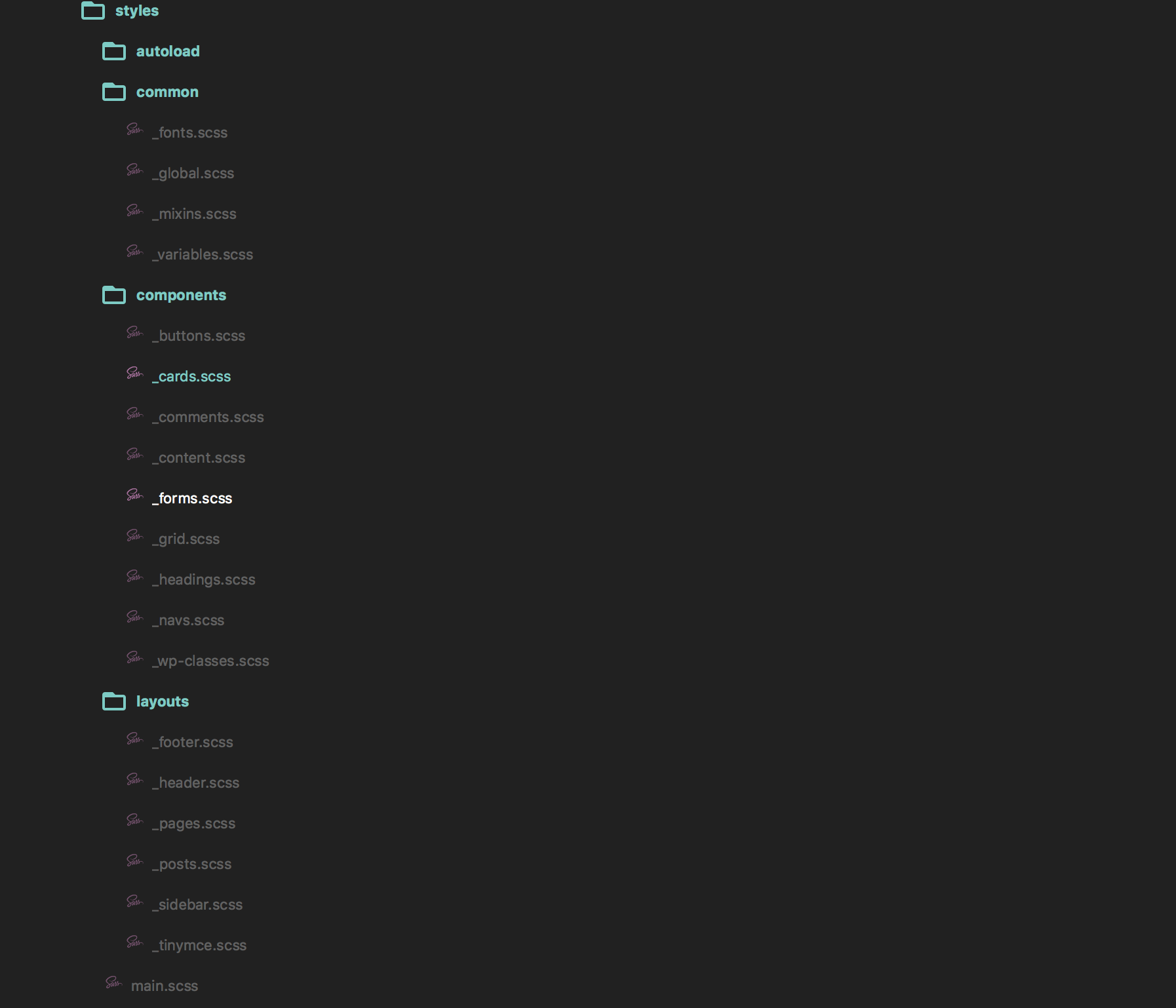
I’ve been through the various trends of resetting and normalizing CSS, from Reset CSS to Normalize.css. Both were excellent in different ways and I still refer to Normalize.css as needed. I’m writing for today’s browser so many of the legacy resets and normalizing isn’t necessary, as long as the content shows up.
There are a few rules that I start with when writing a theme.
See the Pen CSS Starter Minimal by Micah (@asuh) on CodePen.
The only one I’ll highlight is the box-sizing: border-box rule, which is less necessary today than when Paul Irish came up with it many years ago however is still helpful for various positioning and sizing quirks. It’s so standard now that most major CSS libraries and frameworks already include it.
Web fonts are all the rage since the early 2010s. I have used many in the projects I’ve worked with but decided it was unneeded http requests. So, I’m using a neat little font stack nicknamed System Font Stack. I learned about this stack from Smashing Magazine and CSS Tricks and I think it’s the best suited stack for most devices since each operating system is optimized for its specific fonts. So that lead me to using Jonathan Neal’s version.
See the Pen System Font Stack by Micah (@asuh) on CodePen.
I like how each of these is slightly different but still as beautiful as the next one.
CSS in 2018
One of my major goals with this design was spending time with CSS Grid Display. I’ve worked with flexbox layouts for so many years, and before that using floats, that I wanted to see how simple today’s CSS works. 2017 brought all modern browsers up to date with CSS Grid Display and 2018 continues the momentum that bloated libraries aren’t necessary for smaller to mid-sized projects.
When I first started learning, I saw a few example of layouts I wanted with a mix of grid display layouts that made sense to me. What I didn’t realize is how little code is needed to create so many options, nor did I expect I’d put it on the body element!
Every grid I’ve created has at least three rules:
<pre>display: grid;

grid-template-columns: repeat(12, 1fr);

grid-gap: 2rem;</pre>
The values vary depending on the viewport size and dimensions but this essentially makes up the whole site. The rest of the elements that go into the grid use grid-column: x / -x, and this defines which columns of the grid these elements begin and end.
With that in mind, I wanted layout options. Sometimes, I might want to span a large photo to take up the viewport width at all sizes as the top hero image above the article content.
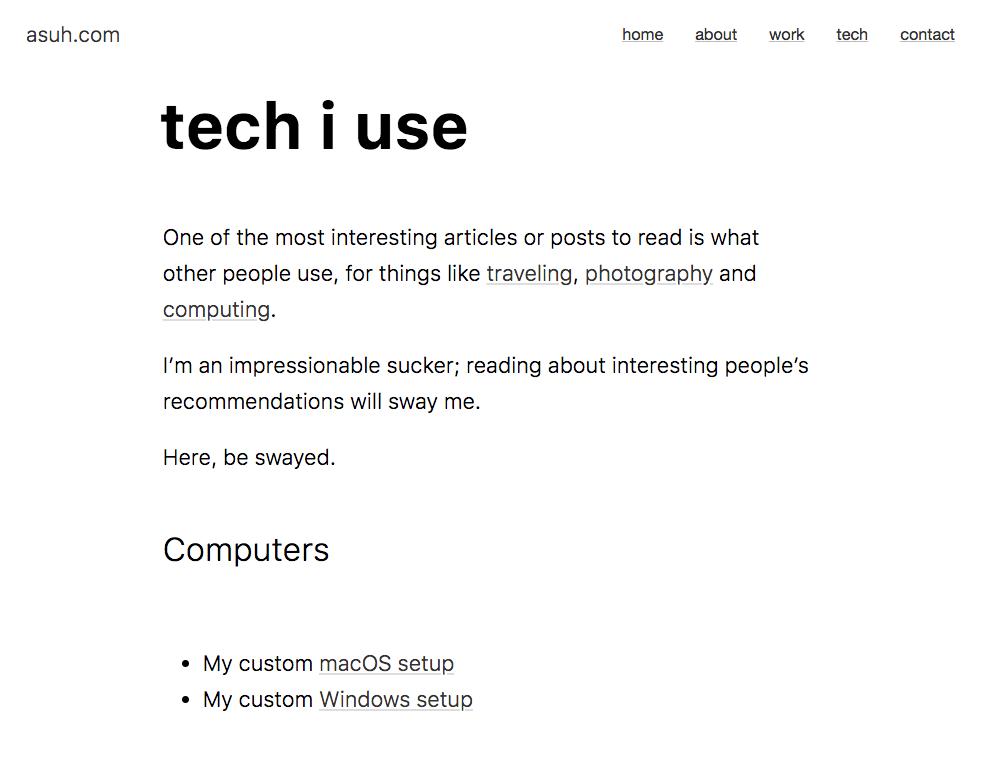
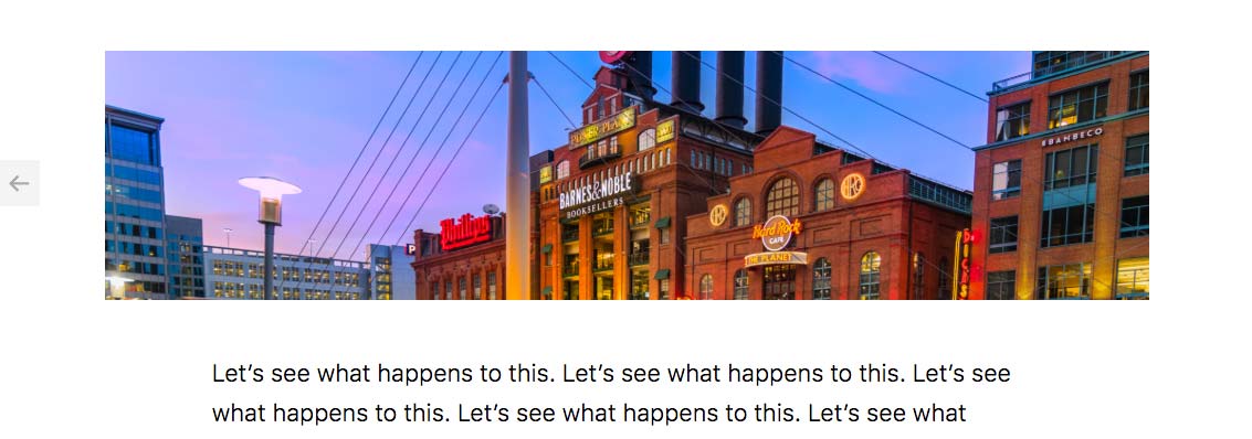
So in a non-singular post, such as a the front page or archives template, you’ll see a large photo post taking up more room than the content:
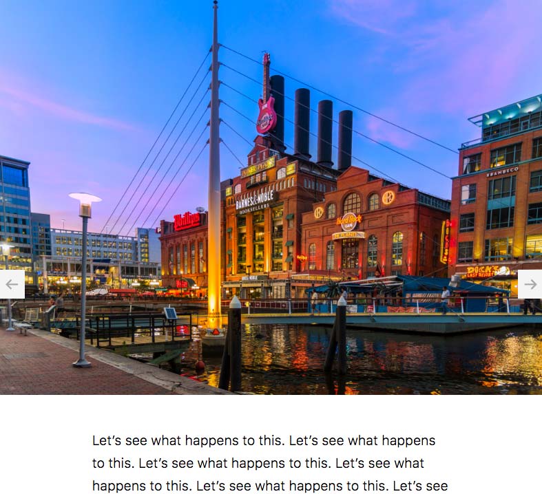
And then in a singular post, such as a Post, Page or Attachment, it’ll take up the width of the viewport:
It took me more than a couple refactors of the code to get this right but once I got it, I love the effect. It’s the kind of flexibility I now expect from CSS Grid Display. I’m no longer dependent on a global wrapper or container class around all the content inside of the body of a page!
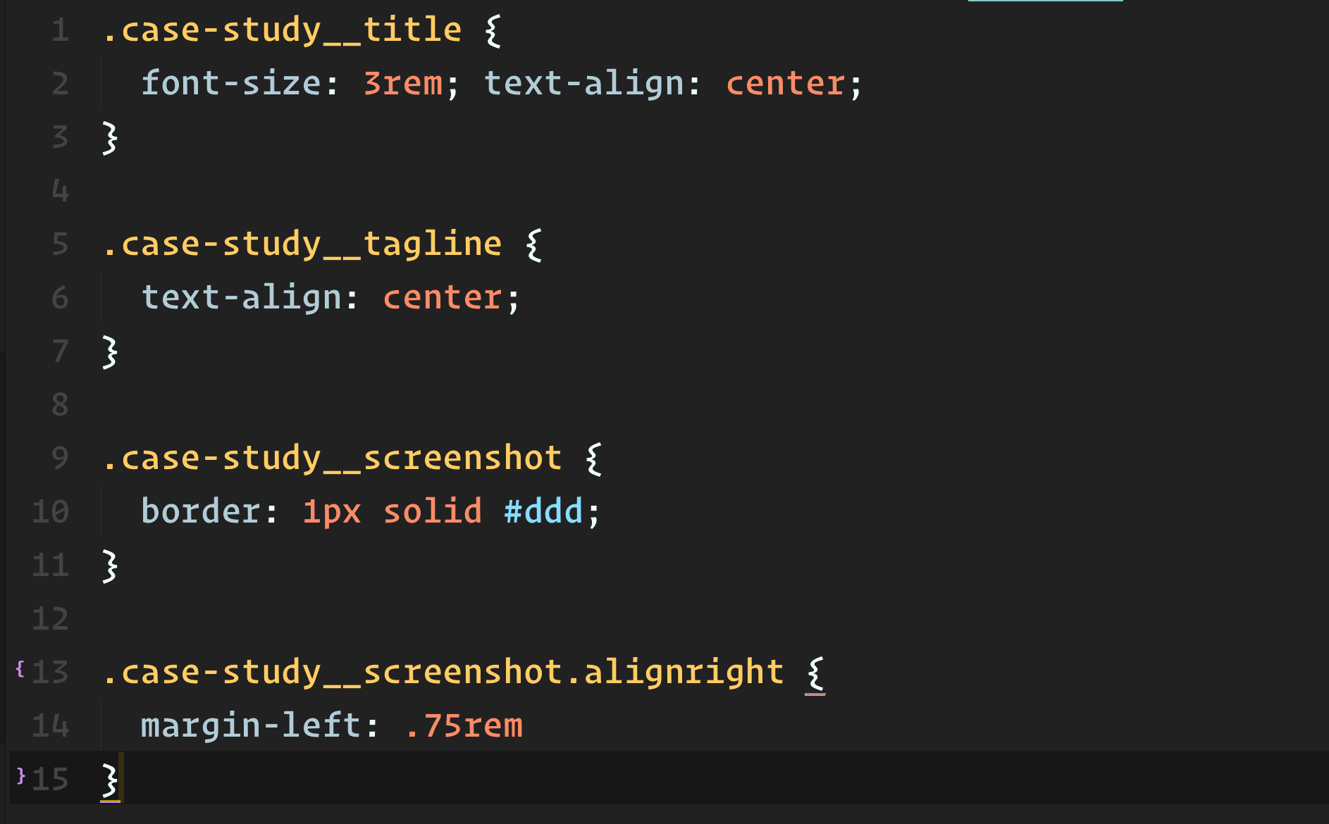
This now moves the site in a direction where I can use component based design rather than page based design. Using techniques like BEM or Smcss, where I write classes that are specific to a component, developing a new feature using component based design allows easy portability of code within any template. In fact, I’m using it on my Case Study pages here!
This is a shift over the last twenty years of web design and trickles down to graphic designers not having to waste time in Photoshop creating full-page designs. We can now use a combination of prototyping in a browser and focus the Photoshop files on things like what a component will look like. WordPress’ opinionated styling and TinyMCE editor get in the way of this to some degree but part of the fun is finding ways around this, such as using the Text mode in the post editor.
The other thing I was fascinated to learn was CSS Variables. A good CSS Variables tutorial helped me understand better how to use them for colors.
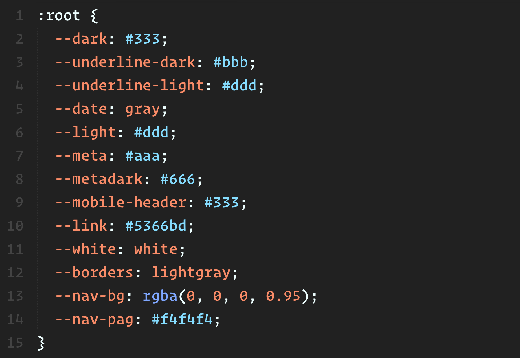
I will be learning more how to better use them for layout dimensions. I currently use a combination of Sass variables and native CSS variables until it I better learn how to utilize each type of variable’s strengths and weaknesses.
Speaking of which, all my styles are written in Sass partials that are compiled down into a minified CSS file. Since learning about Sass in the last decade, it’s a regular addition to my projects. However, as I’m sure most people do, I’m simple with my Scss files mainly sticking with nested rules, Sass variables, and some Mixins. Getting into more advanced concepts of Sass functions is still daunting from planning out the functionality. I admire the potential but it’s not a practical way to spend time writing CSS unless I have an abundance of time.
No jQuery
It’s still practically unheard of to see WordPress sites that don’t use jQuery if you’re using standard templating and themeing from WordPress. I’m looking to a future where Javascript will be supported so well in modern browsers that an inclusion of jQuery is just an unneeded HTTP request. There’s nothing on this site that needs jQuery, and when I do add more interactive features, I will start with the newer Javascript versions like ES6.
It’s an interesting time for Javascript and as WordPress moves more into that direction for its core functionality there will eventually be a noticeable division of themes: legacy including jQuery and progressive not needing anything. Since a large number of plugins, likely even a majority, include or enqueue jQuery by default, it’s going to take years to move past this as a necessity in WordPress. At some point in the not so distant future, if I want to include Bootstrap it will also be completely free of jQuery.
Today, at least on the front page, I do not load jQuery. I intend to get every page to do the same.
Performance
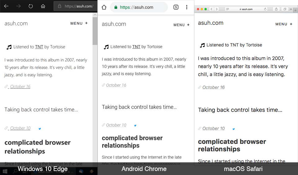
Search engines algorithms now have a bias for sites that load fast. With the goal to reduce loading as many assets as possible, I’ve been able to see decent loading times both on different speeds and devices. One really interesting too is the new Lighthouse integration into Chrome DevTools.
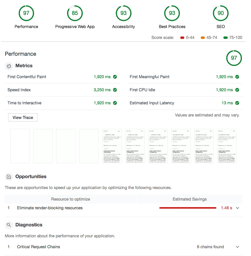
You get feedback on how fast your current page is loading, what can be fixed to improve loading times, and more broad range suggestions for things like offline support with service workers and SEO. It’s a comprehensive tool that nicely complements using the Network tab to see how your site assets are loading.
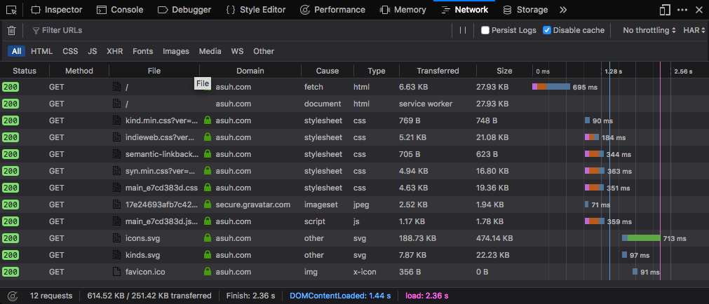
The above results define that I can further optimize by eliminating some render-blocking scripts, further reduce the size of certain files, and use some form of caching and compression. The amount of CSS files could easily be reduced to one concatenated, minified and compressed CSS file. I need to further investigate how to include attributes like async and defer into styles and scripts so they won’t block other plugin assets from loading. All of these are the type of puzzles I love solving as a front-end developer!
Oh, and look below at my footer. I’ve included a little script to show how fast (or not so fast) all my pages load!
Indieweb
One spark that got me back on my site updating it was the reality of social media, control, and privacy. I remember many years ago that getting involved with social media was a trade off especially considering that I host and run my own website. The critical adoption of the various sites drove me away from asuh.com, but the privacy issues, security breaches and understanding that I will probably lose most of what I’ve contributed elsewhere is what brings me right back.
Indieweb is a growing movement mirroring the older days of the Internet when more people had their own blogs and websites and would post everything from their own platforms. Self-hosted CMSes like WordPress are the perfect place to take back control of your content. With a MySQL database to store everything in, it’s easy to give that data a more personal home where you won’t be afraid of losing it.
To make a standard WordPress theme work with what Indieweb has to offer, there are multiple plugins that must be installed and the theme must support Microformat 2 markup. One of the more admirable goals is to give each person the ability to do a lot of the same things you currently can do on social media sites, such as creating Tweets, Likes, Reposts, Replies, and Check into place capability. In fact, an even more exciting future is approaching where a lot of these types of events will be consumable and visible across multiple sites using Webmentions. If I go to someone’s blog and “Like” their post, I will have a record of it on my own WordPress instance and they will see some notification of that on their site as well. I could leave a comment on someone’s blog post by writing a short note on my own site referencing the remote post’s URL. The possibilities are super appealing!
Conclusion
I used my personal site design to challenge myself as a developer and learn new technologies that I’m interested in. My main takeaways:
- Roots Sage theme is a fascinating WordPress theme that will help me learn more about modern design in WordPress
- I want to incorporate Vagrant, maybe even Docker, into more development environments for future projects
- I can’t wait to keep learning more about CSS Grid Display and CSS Variables among others
- Javascript is progressing to a more functional, better defined language and in another phase of working on my site I hope to tackle loading pages in a SPA type way
- Performance is critical. WordPress needs some tweaks to handle things like Service Workers and asynchronous CSS and Javascript but I hope to make some progress on that soon.
- I’m on board the Indieweb train and will do my part to help enrich the ecosystem and Internet as a whole to help everyone take back control
asuh.com has a new life and potential I’m looking forward to taking advantage of and I hope this momentum carries me into the next decade.