all in on popover modals
Let’s talk about the new popover feature added to HTML. I decided to create a few versions of a modal that contains a search form, just to both get experience as well as prove that this is a good new use of a popover. I am biased but I’m completely on board!
Because responsive websites have so many features that need to work from small to large devices, sometimes we have to make decisions that universally provide necessary features but don’t add too much complexity for users. One of those is a search field that can fit on all devices, and it’s this feature that led me in the direction of a modal.
Yeah, I know, modals are overused. They distract from the main content, take focus away from the important parts of site. However, adding a search form to a modal provides a much used feature with minimal impact on mobile layout structure, allowing for more components in a small area.

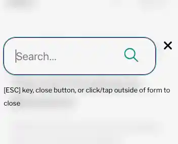
To activate the search form, the magnifying glass icon is a button and requires to be pressed or tapped. A search form appears inside of a modal that overlays the screen, blurring the background.
Since spring of 2024, we have a new feature of HTML, using an attribute, called popover. This new addition to the language provides some really great superpowers:
- No javascript required!
- Automatic overlay, highest z-index
- Light dismiss (clicking/tapping outside of the popover element)
- Default focus management
- Keyboard binding for improved accessibility support
- Support for
::backfillpseudo element (wanna blur the background without extra code!)
If I was talking to my 2000s web designer self, he would describe this as magic! Because, well, it really is so simple and easy.
Here’s a CodePen of my first version of this:
The best thing about the above component is that you can try it out on all the modern browsers with success… unless you’re using Safari on iOS. With the help of Luke Warlow, he found and reported a Webkit bug that the light dismiss behavior doesn’t work.
Because of the above bug, in order to have universal support, I created another version that includes a button inside of the popover that mostly duplicates the button trigger that opens the popover, but instead this one closes and dismisses the popover.
Just to fun, I took one more try at making a version that uses the dialog element, which has been available since 2022. The main reason I did not go this route was to attempt a new, accessible element with no javascript. Buttons that open dialogs have at least one inline onclick="dialog.showModal()" attribute that’s required for the dialog to appear. Adding light dismiss also requires a little script, as you can see in the CodePen example. Additionally, the dialogs don’t need any additional code for focus to just work right, which is very nice.
You have your choice in these examples so feel free to borrow or steal whatever you want!
Responses
Comments are closed.