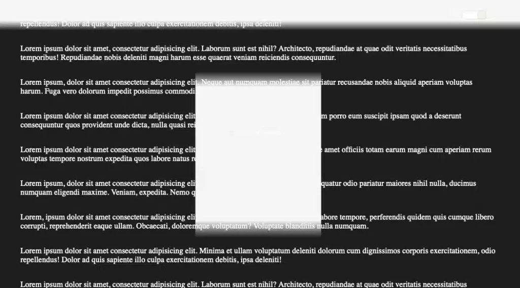
come on, safari
I’m nearing the end of the first phase of a website redesign, teaching myself new CSS, and sprinkling in some JS. Of the things I’m learning, I’m also rediscovering some old Safari linear-gradient issues and seeing some new Safari positioning bugs.
You can follow along if you view the CodePen titled “color-scheme, light-dark, Safari bug”.
The original point of the above pen is to verify linear gradient issues with Safari.
Webkit-based linear-gradient issues are well documented, they behave differently because of the transparent color values. You can see this by switching the theme mode from light to dark, or dark to light. I keep running into linear gradient issues in Safari because I infrequently use them with transparent values and forget they’re still an issue.

Try the above pen in Firefox or any Chromium browser and the linear gradients are consistently working when switching between dark and light mode.
I found 3 more issues having created this:
- In
.square, Webkit doesn’t seem to center things consistently using justplace-items: center. I am forced to addplace-content: centerto make the content “this is a square” center consistently with the other modern browsers aspect-radio: 1 / 1doesn’t actually work right for the content area of.square. It’s elongated into a rectangle.- Adding
position: fixedto.square, which is already centered using theplace-*rules breaks the positioning only on Webkit. I am forced to use older positioning methods, i.e.left,top, andtransform.