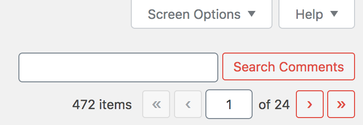
wordpress 5.3 buttons are weird
I updated WordPress to version 5.3, saw the changes to the button styles, and then came upon this.

I like the updated button styles, which in isolation, are transparent background colors with text and borders that are colored. This style works sometimes and is a good contrast from the button styles with solid background colors.
I don’t like that the hover or focus states of these new button styles barely changes. I also don’t like how closely the buttons mirror the form elements. There’s inconsistency in button styles throughout the whole system now with some that use solid background colors and others using transparent background colors.
I’m disappointed in this from a UX perspective. The overall state of WordPress accessibility might have improved in 5.3 but this feels like a regression.
EDIT: It looks like many others share this opinion, in different ways.
https://make.wordpress.org/core/2019/10/18/noteworthy-admin-css-changes-in-wordpress-5-3/
Responses
Comments are closed.